
18 February 2020
In our copy shop group meeting we all liked the layout of the images vs. text in this book on Olafur Eliasson’s words, that I had issues for my ADAS essay. We thought it was a nice composition, playing on the white space to direct attention to the images. Also, some images were desaturated to highlight text or more important images.. We are going to try and apply this layout as templates for our pages.
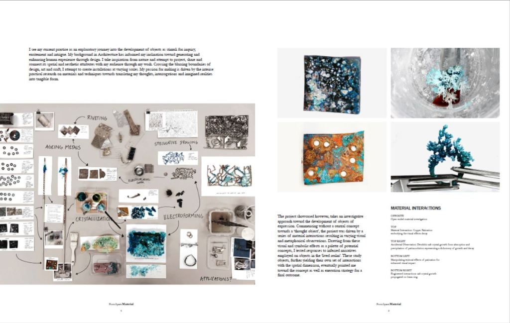
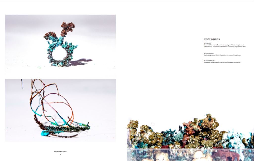
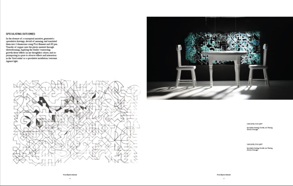
To start with, I just followed the proportions of page layouts in the book and tried to fit my content here. My Images arranged according to reference layout:
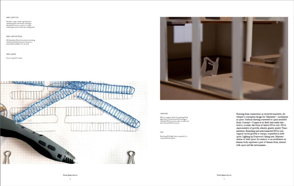
Last page will be a full bleed image of my final outcome, that I will photograph in Francesca’s maquette on Monday.
